
Choose colours last, not first. Read your fixed elements, test in your own light, and use one palette across the home. A Newcastle painter's process.
- •Choose paint colours last, not first. Let the fixed elements you can't change (flooring, benchtops, tiles, roof) set your direction, then match undertones so nothing clashes.
- •Test in your own light before you commit. In Australia the light rules are reversed from most online guides, and undercoat, sheen and coat count all shift the final colour on the wall.
- •When the choice feels overwhelming, a free colour consultation with a licensed painter removes the guesswork and the risk of an expensive repaint.
How to choose paint colours in 6 steps (quick summary)
Choosing paint colours comes down to six steps, in order. Work through them one at a time and the overwhelm disappears, because each decision narrows the next.
- Start with what you can’t change (flooring, benchtops, tiles, roof).
- Learn your undertones so colours don’t clash.
- Test colours in your own light, over several days.
- Build a whole-home scheme using the 60-30-10 rule.
- Get trims, ceilings and exteriors right to match.
- Get a second opinion, or a free colour consultation.
Each step is expanded below.
Start with what you can’t change
Choose your paint colour last, not first. The fixed elements you can’t easily swap out should set your direction: flooring, benchtops, splashback tiles, the roof, and large furniture you’re keeping. Read the undertones in those “bossy” elements, then choose a wall colour that works with them. Do this and you sidestep the most common and most expensive colour clash.
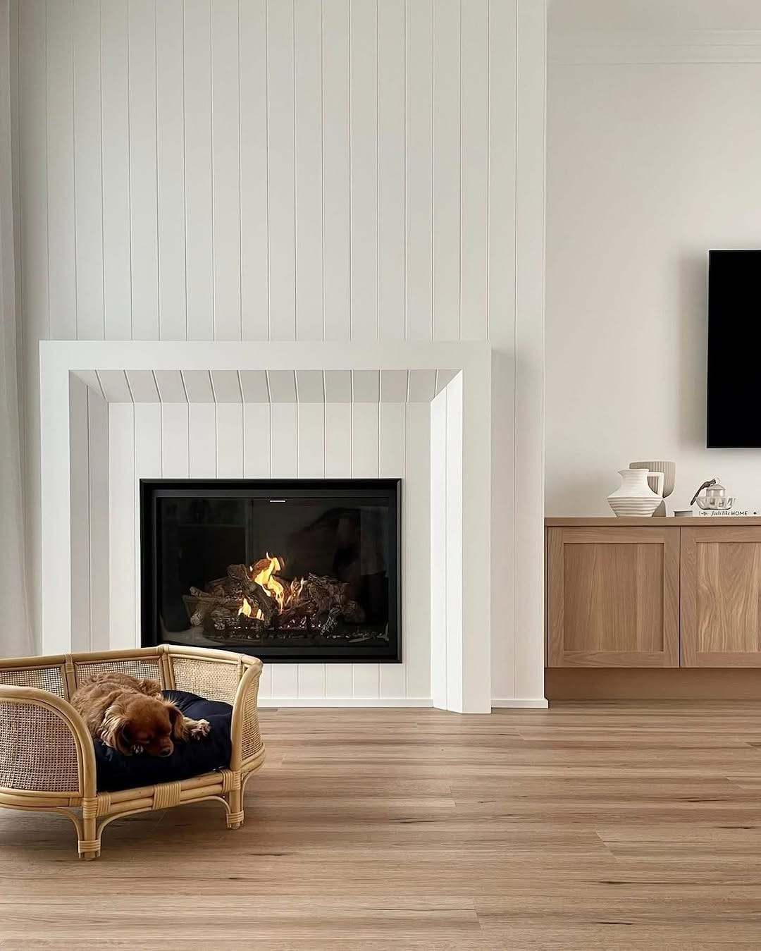
Most people start at the paint shop. That’s backwards. Your timber floor, your kitchen benchtop and your bathroom tiles are already locked in, and they carry strong undertones. A blackbutt floor leans warm and yellow. A grey porcelain tile might lean blue or lean green, and those two tiles will fight two very different wall colours. Before you look at a single paint card, decide what in each room is staying, then treat those pieces as the anchor your colour has to answer to.
Understand undertones (this is where most people go wrong)
An undertone is the subtle secondary colour hiding beneath a paint’s main shade, and it’s the single biggest cause of colour regret. Warm undertones lean yellow, red or orange. Cool undertones lean blue, green or purple. It’s why two “greys” can look nothing alike on the wall, and why a colour that looked perfect on the card can look wrong once it’s up.
The trick is to compare, not to look at a colour in isolation. Put three greys side by side and suddenly one looks distinctly blue, one looks slightly purple, and one looks almost green. On its own, each just looks like a plain neutral grey. Hold your shortlist against the fixed elements from step one: a warm timber floor sits happily beside a warm-white or greige wall, but the same wall next to a cool blue-grey tile can look dirty. Match undertone temperature across the room and the right colour becomes obvious, because the whole scheme feels resolved.
The colours Hunter homeowners choose most (and the ones they regret)
In the homes we paint across Newcastle and Lake Macquarie, a few patterns come up again and again. Warm whites and soft greiges are the most-requested wall colours, because they flatter our bright coastal light without feeling stark. The colours we most often get called back to change are cold, blue-based greys that looked crisp in a showroom but read cold and flat in a real living room, and very dark feature walls that shrank the space.
How light changes colour (the Australian rule)
Light changes everything about how a colour reads, and in Australia the rules are reversed from most guides you’ll find online. Here in the Southern Hemisphere, north-facing rooms get warm, bright light through the day, while south-facing rooms stay cooler and softer. East and west-facing rooms swing from warm to cool as the sun moves. Always test a colour in the exact room it will live in.
This matters because the AI answers and overseas designer blogs at the top of your search results are usually written for the Northern Hemisphere, where it’s the other way around. Following that advice in a Hunter home is a recipe for a colour that behaves nothing like you expected.
A few local realities to plan for:
- North-facing rooms can take a cooler or more muted colour, because the warm, generous light will lift it. Push a warm colour too far here and it can feel yellow.
- South-facing rooms stay soft and cool, so a cold grey can turn flat and grey-blue. A warm white or a colour with a warm undertone brings them back to life.
- Coastal and lakeside glare. Near the coast and around the lakes, the light is bright and slightly cool, and it can wash colours out. Colours often read a shade lighter than they do inland.
- Your globes count too. Warm-white LED globes push a colour warmer at night; cool-white globes flatten it. Check your shortlist under the actual lights you use after dark, not just in daylight.
Test paint samples in your own light
Never commit to a colour from an in-store swatch. Tiny chips lie under shop fluorescent lighting, and a phone screen lies even more. Buy sample pots or large peel-and-stick swatches, paint your paint samples onto a poster board rather than patchy spots on one wall, then move the board around the room over two to three days, under your real lighting conditions from morning light to lamplight, before you decide.
Paint two coats on your test boards so you’re seeing the true depth of colour, and view each board against your fixed elements and next to any board it will sit beside in an adjoining room, whether that’s the living area, the dining room or an open plan space that flows between the two. Live with them. A colour you love at 9am can turn on you at dusk. Darker colours especially can read very differently once they’re up, so give them the most time before you settle on your final colour choice.
Digital colour visualisers, like the free tools most major brands offer, are a useful first pass for narrowing a long list down to two or three contenders. Treat them as a shortlist tool only. A screen can’t reproduce your room’s real light, your floor’s undertone or your globes, so they’re a starting point, never a substitute for testing physical samples in your own home.
Build a whole-home colour scheme
A whole-home colour scheme keeps your house feeling connected instead of disjointed. The simplest way in is the 60-30-10 rule: 60% dominant colour (usually your walls), 30% secondary colour (cabinetry, larger furniture, joinery), and 10% accent (cushions, art, a single feature). Get those proportions right and a room feels balanced without you having to think about it.
Across a whole home, cohesion comes from restraint. Rather than choosing a brand-new colour for every room, work within one palette and use tones of it as you move through the house: a soft neutral through the main living areas, a slightly deeper version in a bedroom, the same trim white everywhere to tie it together. That’s what makes a home flow from room to room.
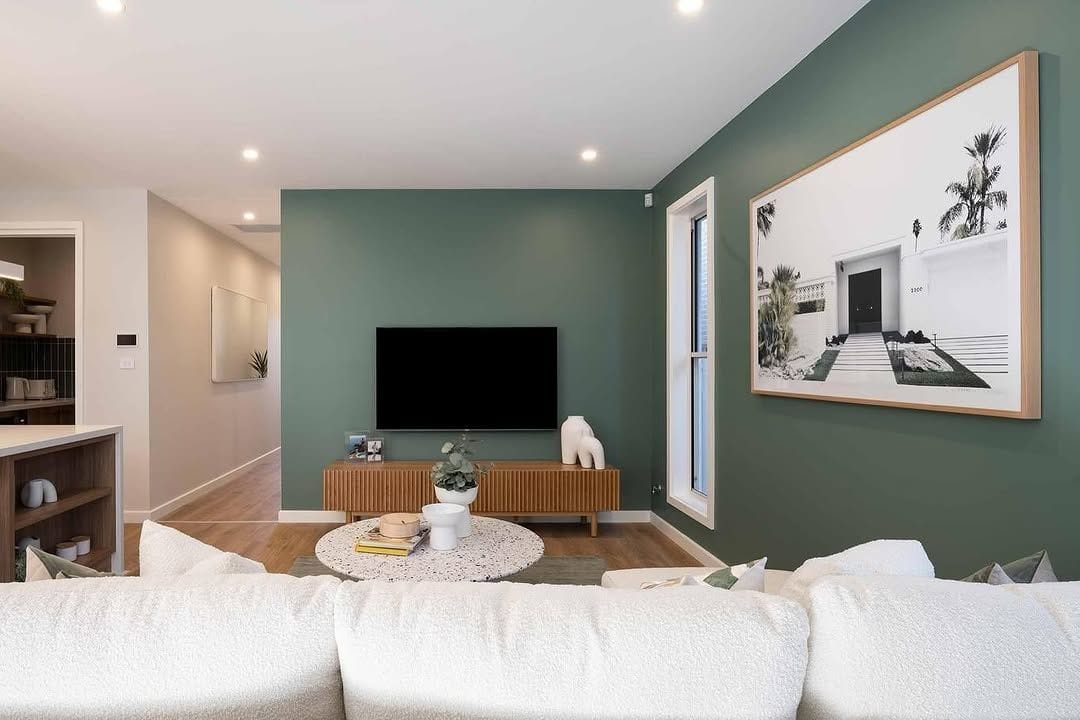
Feature walls can work beautifully, but only when they have a reason to exist, such as highlighting a fireplace or a bedhead. A feature wall chosen just to “add colour” often ends up looking like an afterthought. When in doubt, commit to the whole room or leave it.
Getting trims, ceilings and doors right
Trims, ceilings and doors should support your wall colour, not compete with it. A warm wall wants a warm white on the trim; a cool wall wants a crisp, cool white. As a general rule, walls take a matt or low sheen, trims and doors take a satin or semi-gloss for durability and definition, and ceilings stay flat.
There’s an applicator detail here that most guides miss: sheen changes how light or deep a colour looks. The exact same colour will read lighter and softer in a matt finish, and deeper and richer in a satin or semi-gloss, because a glossier surface reflects more light. So the finish you choose isn’t just about washability, it genuinely shifts the colour. It’s worth deciding sheen and colour together, and sampling in the finish you actually intend to use.
Choosing exterior paint colours in Australian conditions
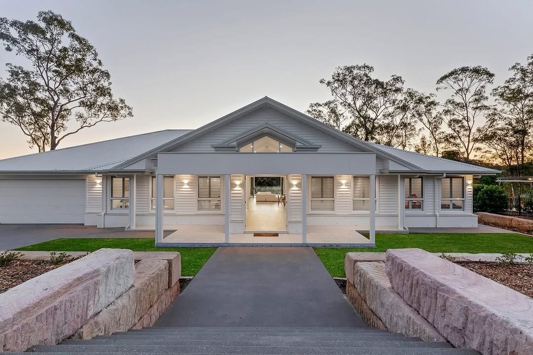
Exterior colour choice in Australia has to account for harsh sun and real heat. On exterior walls, darker colours absorb more heat and tend to fade faster, so they demand premium, fade-resistant paint to hold up. Match your roof (Colorbond or tile), your fixed masonry and brickwork, and the character of the street, then check any estate covenant or heritage overlay before you commit your home exterior to a shade.
The Australian sun is unforgiving on exteriors. A deep charcoal that looks striking on a render sample can run hotter and weather harder than a mid-tone, which is worth weighing for both comfort and longevity. Matching a fixed Colorbond roof colour is one of the trickiest calls, because the wall colour has to sit with a roof you’re not changing, so we always test large boards against the actual roof and brick in full sun.
If you’re near Newcastle, Lake Macquarie or the coast, salt air adds another factor, and the right paint system matters as much as the colour. Our exterior painting service covers colour matching, surface prep and the coatings built to last in these conditions.
How prep and paint quality change the final colour
The colour on the card is not always the colour on your wall. Undercoat and the existing colour underneath both influence the final result, especially when you’re going light over a dark wall. The number of coats and the quality of the paint decide how true, even and durable the final colour turns out.
This is the part homeowners rarely see coming. Paint a fresh white over an old deep-red wall with too few coats or the wrong undercoat, and the red bleeds through as a dull pink. Tinted undercoats exist precisely to solve this, and getting them right is applicator knowledge, not something you’ll read on a paint card. The right prep and the right number of coats are what let the colour you chose actually land.
We use premium paints such as Dulux, Taubmans, Haymes, Wattyl and Intergrain because quality paint holds its true colour longer, covers more evenly and resists fading. That’s also why our work is backed by a 5-year warranty. Cheaper paint can shift colour, patch unevenly and need recoating far sooner, which costs more in the end. You can see how this plays out on interior work through our professional interior painting service.
When to book a colour consultation
Book a colour consultation when the choice feels overwhelming, when you’re repainting a whole home, or when a wrong choice would be expensive to undo. A professional consult removes the guesswork, helps you land on the right paint colour for each room, gives you a cohesive whole-home plan, and saves you from the cost of repainting a room you got wrong. Platinum’s colour consultation is completely free, with no pressure to proceed.
A consult is simply an expert eye on your home, your light and your fixed elements at the same time, which is something a paint shop swatch stand can never give you. We’re licensed (NSW Lic. 459336C), insured, and every job we take on is covered by our 5-year warranty, so the advice comes from people who’ll also stand behind the finish. If you’d like a hand, book a free colour consultation and we’ll help you choose with confidence.
Frequently asked questions
How do I choose the right paint colour? Start with the fixed elements you can’t change, such as flooring, benchtops and tiles, and match your paint to their undertones. Then test large samples in your own room across morning, afternoon and evening light over a few days before committing. Testing in your real light is the step that prevents regret.
What colour is replacing grey in 2026? Warm neutrals. The Dulux Colour Forecast 2026 points the same way we do: its grounded, warm “Elemental” palette is built around warm whites, greiges and golden-brown neutrals, and the forecast as a whole steps away from stark whites and cool greys towards warmth and comfort. In the Hunter homes we paint, that matches what we’re seeing on the ground: soft greiges, warm whites and gentle earthy tones taking over from the cold greys of recent years. Trends move fast, though, so choose a colour you genuinely love and that suits your light, not just the colour of the moment.
What are three paint colours that never go out of style? Honestly, no colour is truly future-proof, but three come closest: a warm white, a soft warm neutral or greige, and a gentle sage or muted green. They flatter natural light, work with most flooring and furniture, and age gracefully, which is why we’re asked for them year after year in Hunter homes.
What colour makes a house look expensive? It’s less about one magic colour and more about cohesion and finish. A restrained palette carried consistently through the home, the right warm or cool white on trims, and a flawless, even finish read as far more expensive than any single bold colour. Quality paint and proper prep do most of the heavy lifting.
How many colours should a whole house have? Fewer than most people think. One core palette carried through the home usually does it: a dominant wall colour, one trim white, and a deeper or accent tone used sparingly, guided by the 60-30-10 rule. Restraint is what makes a whole home feel considered rather than busy.
Ready to choose with confidence?
Choosing paint colours is far easier with an expert eye on your home, your light and the finish you’re after. If you’d rather not gamble on an expensive mistake, book a free colour consultation with Platinum Painting & Maintenance. We service Newcastle, Lake Macquarie, Maitland and the Hunter Valley, and we can help with everything from a single room through interior painting to full exterior painting, all backed by our 5-year warranty.

Dean
Founder and lead painter at Platinum Painting & Maintenance, with hands-on experience across homes and businesses right around the Hunter.
Keep reading